What a Great Digital Poster Should Have

Clients are more likely to notice a large, eye-catching poster. Creating such a poster, however, is no simple task. Many aspiring marketers fall into the trap of thinking that more volume equals more attention. If you take the time to carefully consider these considerations and study useful tools like Vista Create, you’ll be able to choose the poster layout that will be most effective for your purposes. A poster’s success or failure depends on a number of factors, all of which are discussed in this piece.

#1. Purpose
The poster’s design should be heavily influenced by its intended use. Before you do anything else, ask yourself a few questions:
- Where will this poster be published?
- What is it promoting: an event, service, or product?
- What is the target audience?
Considering these factors as you plan out your layout and design will yield the best results. If it is meant to promote a specific product, the layout will center around images and provide only the most essential information about the product and how to acquire it. In contrast, if it’s for a specific event, the location, time, and details of that event should be easily found on such a poster.
#2. Audience
What appeals to one generation may be too garish for another since tastes in color and style evolve over time. If you know who you’re creating a poster for, you can tailor the colors, fonts, and layout to catch their eye. In order to create an emotional connection with potential customers, it can be helpful to use visual appeal. Try to see things from the perspective of your potential customers. Before settling on a final design, have a discussion about it with your team and, probably, launch the testing of several ideas.
#3. Color scheme
The most noticeable aspect of a poster is its color. Because of the profound role color plays in our psyche, it can be used as a subtle but effective marketing tool. The poster’s color scheme needs to be selected with a few things in mind.
- Your brand’s color scheme should be cohesive with and reflect your company’s identity.
- The poster’s color scheme will reflect the product or event it’s advertising.
- Concentrate on evoking a strong emotional response in the viewer with the help of your chosen color.
#4. Image
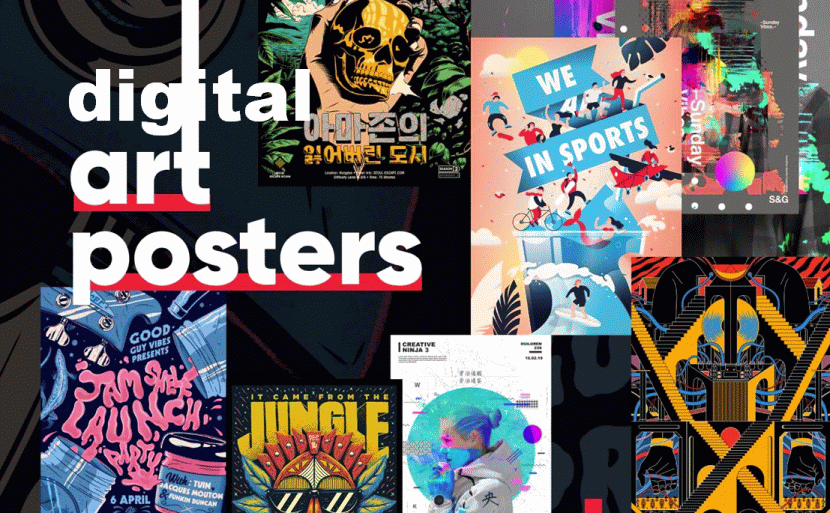
Making a poster rich in visuals is a surefire way to catch people’s eyes at first glance. Given that it will be scaled up for printing, the image must be of high quality. There is always the risk of pixelation when enlarging a low-resolution image. Check out a few ideas on the effective use of images in posters:
- Consider using a full-bleed image as the poster’s background and layering text in a contrasting color to draw attention to important details.
- The use of a collection of small images to publicize an occasion is a clever strategy.
- Use a single large image as the foundation, accompanied by only the barest minimum of text to explain anything beyond the most basic points.

#5. Size and font style
Even from a greater distance, the readability of the poster is affected by its size. A modest poster will go unnoticed, in contrast to an exceptionally large poster, which might be overwhelming for the viewer to take in all at once when looking at it. Pick a size that will attract people’s attention and offers sufficient room for all of the text you want to include without making it difficult to read or compromising the font’s size and style.
Keep in mind that it is a real art to include all the necessary information in a digital poster without compromising its readability and value. Especially if your target audience is mostly viewing content on their smartphones.
Remember that the poster should be fascinating enough for the audience to pay attention to it. The information should be broken up into sections, and both the headlines and the subheadings should be engaging. The font needs to be simple and straightforward to read. Your message can be conveyed more clearly to your audience if the font style, text content, and images that you use are carefully selected.
Closing Words
Well-designed posters can help spread the word about your business. To get the most out of your budget, it’s important to settle on a truly original and attention-grabbing design. When creating an effective poster, the aforementioned factors can be of assistance.

