Why UX Is the Real Competitive Edge in Mobile Casino Startups
Most casino startups come in with the same checklist: fast games, bold branding, and slick bonus offers. It all looks exciting until you tap in. That’s when the cracks show. A confusing layout here, a laggy wallet there, and suddenly the shiny new app starts collecting digital dust. In this sphere, what actually keeps players coming back isn’t the flash, it’s the flow. UX isn’t just how your product looks. It’s how it feels the moment it’s in use, with every tap, scroll, and swipe shaping user trust or causing frustration.
UX Is the Real Game of Chance
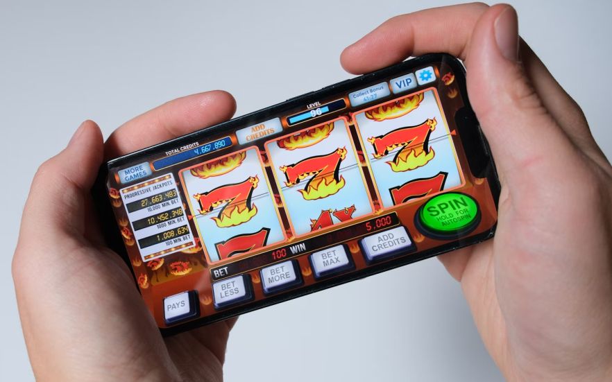
A mobile casino’s UX is its poker face. You can’t see the dev team behind it, but players feel every design decision, from how fast the lobby loads to whether that spin button lands under their thumb. When a mobile casino app is opened for the first time, the slightest hitch makes users question everything: Is this legit? Is my money safe? Is this even worth it? A full overview of top-performing online casinos reveals that slick design and smooth interaction are doing just as much work as the bonuses. If the typography gives off 2010 vibes or the buttons lag, it doesn’t matter what games you offer; you’ve already lost. Good UX is invisible, but bad UX is never forgotten.
Design That Thinks Like a Player
Most casino startups attempt to wow players with flashy animations, big sound effects, or endless dropdowns of features. But experienced players want the opposite: speed, clarity, and control. It’s no coincidence that 94% of users say easy navigation is a must, while 83% value a fresh, polished look. Can I get to my favorite game in two taps? Can I cash out without needing a how-to guide? Clean UX removes the guesswork, and that makes players feel powerful.
It’s the same pattern you’ll find repeated across various case studies of smart UX design. They let the player feel in control without ever needing to ask for directions. A clunky user flow can sabotage your marketing spend. You spend thousands driving traffic, only to lose players at onboarding. You offer a killer bonus, but the redemption path is buried behind seven taps. You build the perfect progressive jackpot system, but users don’t notice because it’s wedged beneath a banner carousel. Startups don’t lose them because they weren’t interested. They lost them because the users just couldn’t figure out how to get started.
Trust, Loyalty, and the Invisible UX Layer
There’s no room for mystery navigation or “where did my money go” moments. Every interaction should reinforce clarity. Is the wallet balance always visible? Do error messages help explain what went wrong? Is it more of a system working together with the user instead of working against them? Transparency is not a regulatory box; it is a UX priority.
Familiarity is one of the reasons players stick with the same app even when there are 20 others offering shinier bonuses. 58% of mobile users are more inclined to favor brands that remember their past behavior. If the app knows their habits, remembers their preferences, and stays smooth even under high server load, it feels personal. And personal beats promotional, every time. It also feeds your flywheel. When players feel at home, they stick around longer, leave better reviews, and start doing your marketing for you. In fact, a good number of happy users will tell more people about a good experience. Five-star ratings, glowing app store comments, “you’ve gotta try this” texts — none of that comes from lucky spins. It comes from UX that respects users’ time, instincts, and attention.
UX Teams Are the New Growth Engine
They’re not just pixel pushers, they’re your trust builders, your retention drivers, your brand architects. They decide whether a player cashes out frustrated or tells their friends how smooth it all felt. In a market where features are copied overnight, experience is the moat. UX keeps coming up as a quiet differentiator in analyses of what helps new casino platforms stay competitive and stick around. It’s the difference between being downloaded and being remembered. The sales team will thank you, also. A smooth UX doesn’t just improve retention, it lifts every metric tied to acquisition, which means lower bounce rates, higher conversions, and fewer support tickets. You’re not just improving how it feels to play, you’re multiplying the return on every ad dollar investment.
Mobile-First Design
Startups that design desktop-first and shrink to mobile are already behind. The winning team’s design for the phone, for one hand, for patchy signals, and for half-second attention spans. They know players open the app while waiting for coffee or riding the bus. UX has to work in real life, not just in Figma. If it drags, confuses, overwhelms, or frustrates your users won’t tell you. In fact, 25% drop out after a single use, 77% of Daily Active Users (DAUs) leave within 3 days, and only around 10% remain after 30 days. And if users wait more than 3 seconds for the app to load, 53% will abandon it. They’ll simply close the app and open a better one.
Trending Now

Top Tech News Today, March 25, 2026